LGTIBCN
Barcelona, 2020
Campaign, Illustration
Client
Ajuntament de Barcelona
Design & Illustrations
Velkro
Creative Direction
Nacho Padilla
Photography
Cassandra Stuyt
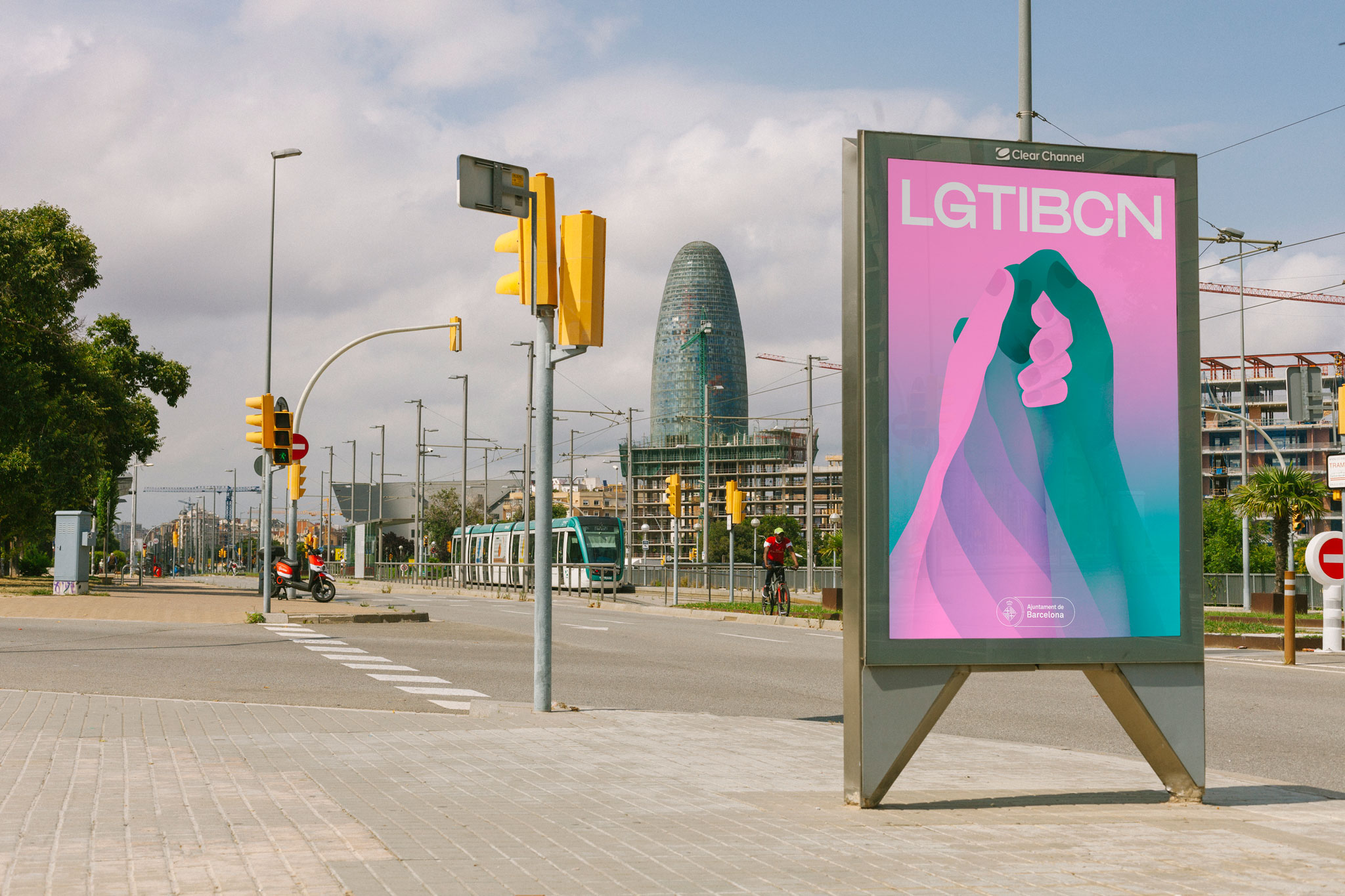
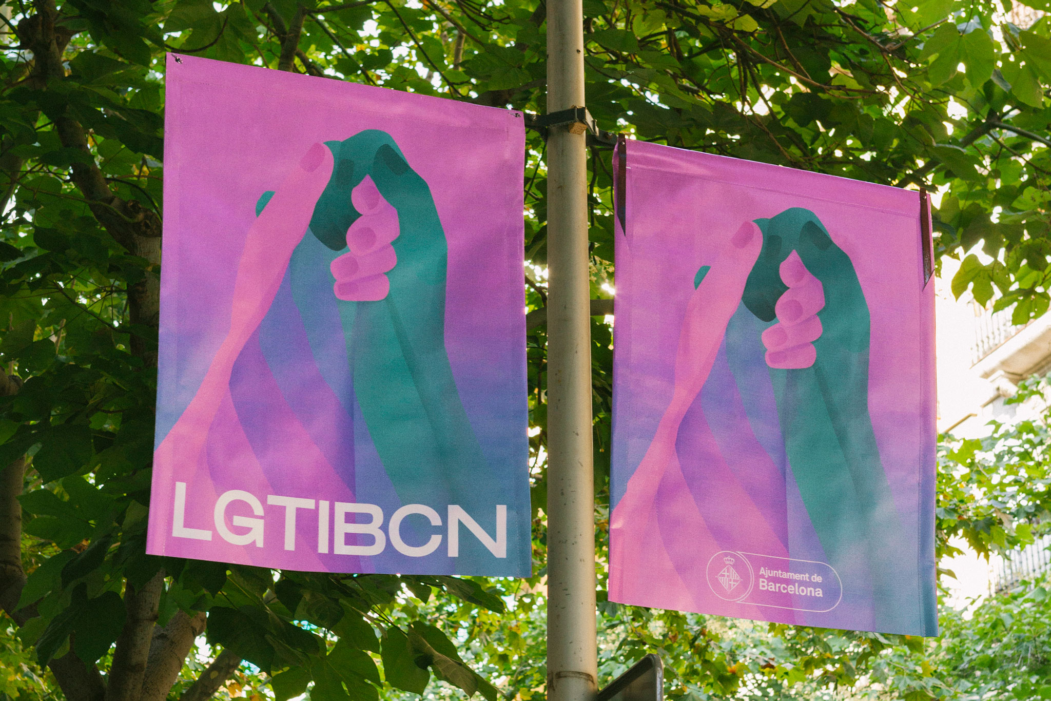
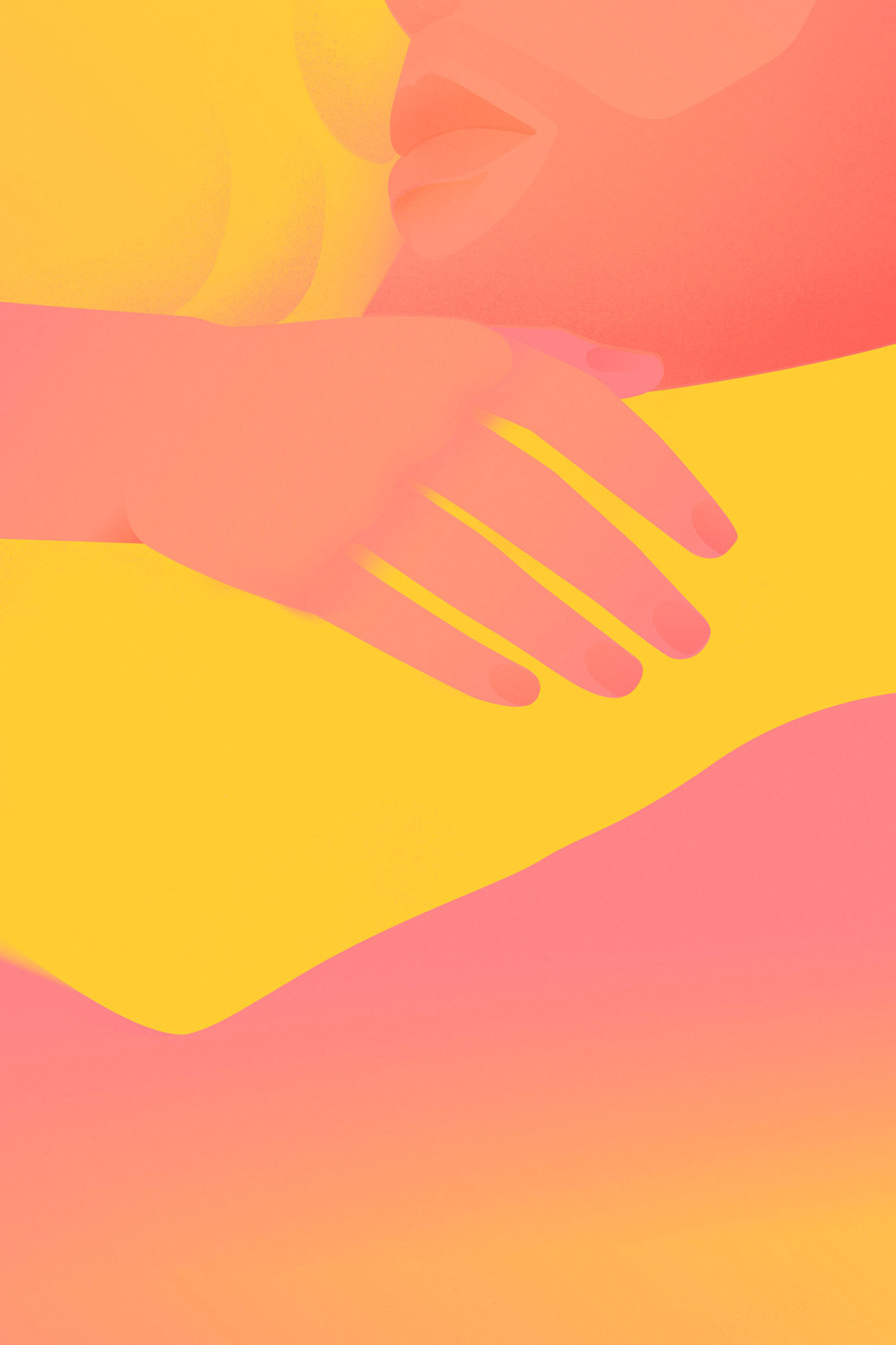
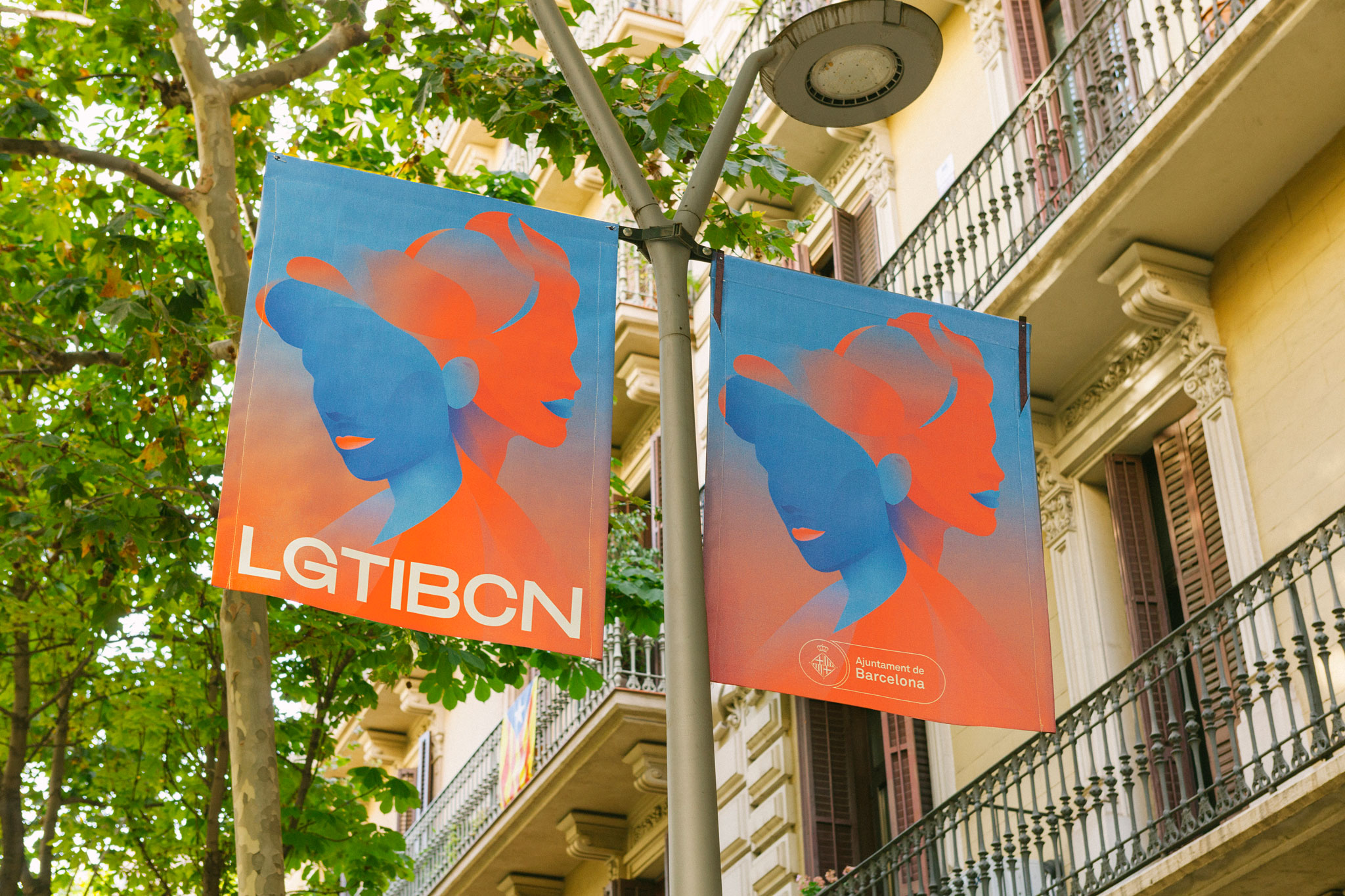
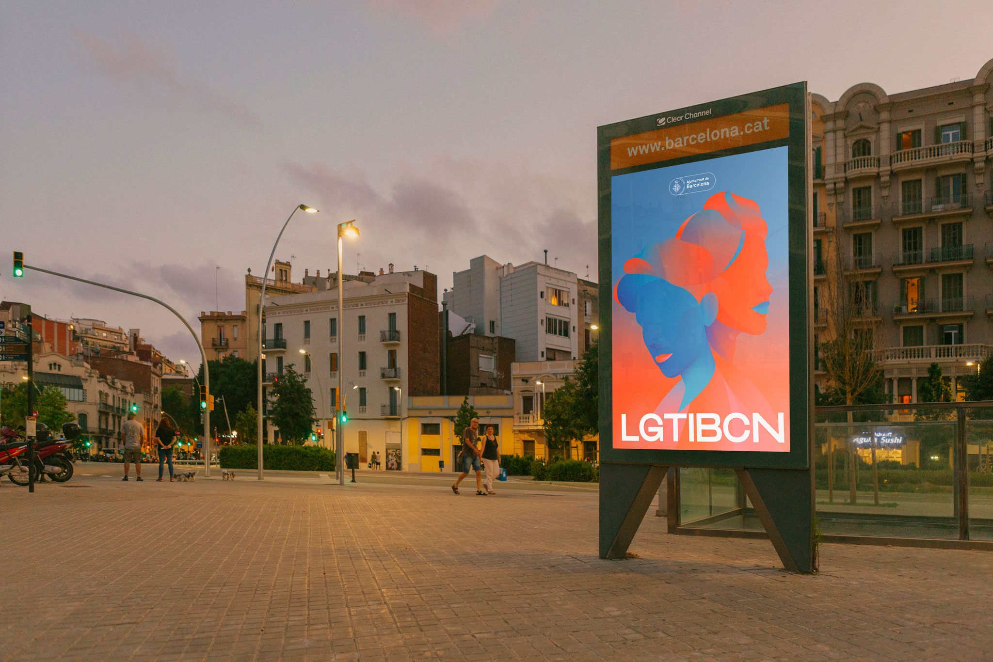
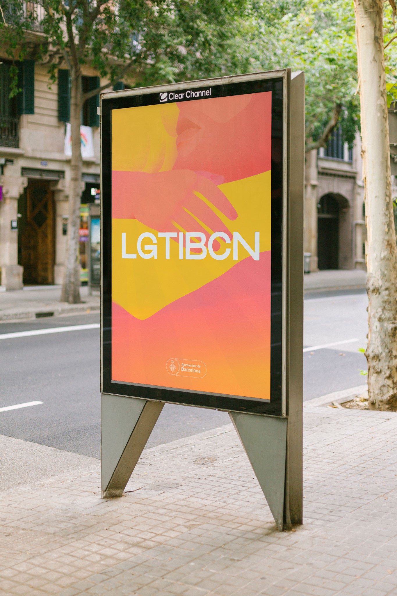
We were asked to design the campaign LGTIBCN of the City Council of Barcelona to show their support to the LGTB+ collectives. We created 3 illustrations showing different focuses of the collective to defend their rights.
The hands holding a rainbow flag remember that people from Barcelona were among the first ones to create groups to defend the rights of the LGTB+ collectives. It also aims to create a link between the LGBT+, the anti-racist and the feminist protests in order to show and stand up for diversity in its totality.⠀
Two faces look in opposite directions, merging with each other to represent the fluidity of gender, transgender people and their depathologisation. It is also a tribute to Sonia Rescalvo, the transsexual woman murdered in 1991 in Barcelona, reported in Spain as the first hate crime against a transsexual.
A fusion of colours that symbolises a hug represents the support of the different networks of protection against the discrimination, the violence and the bullying against LGTB+ children and teenagers.
The colours we used are not from a standard chromatic palette, thus creating a fusion wherein the middle tones take centre stage, to reflect that there is not only one singular flag to represent communities, but rather many that can change and redefine themselves over time.
The acronym is at the center of the composition and the only textual part of the graphics. It uses a geometrical typography that makes no doubt in the fusion between LGTBI and BCN (the acronym of Barcelona).